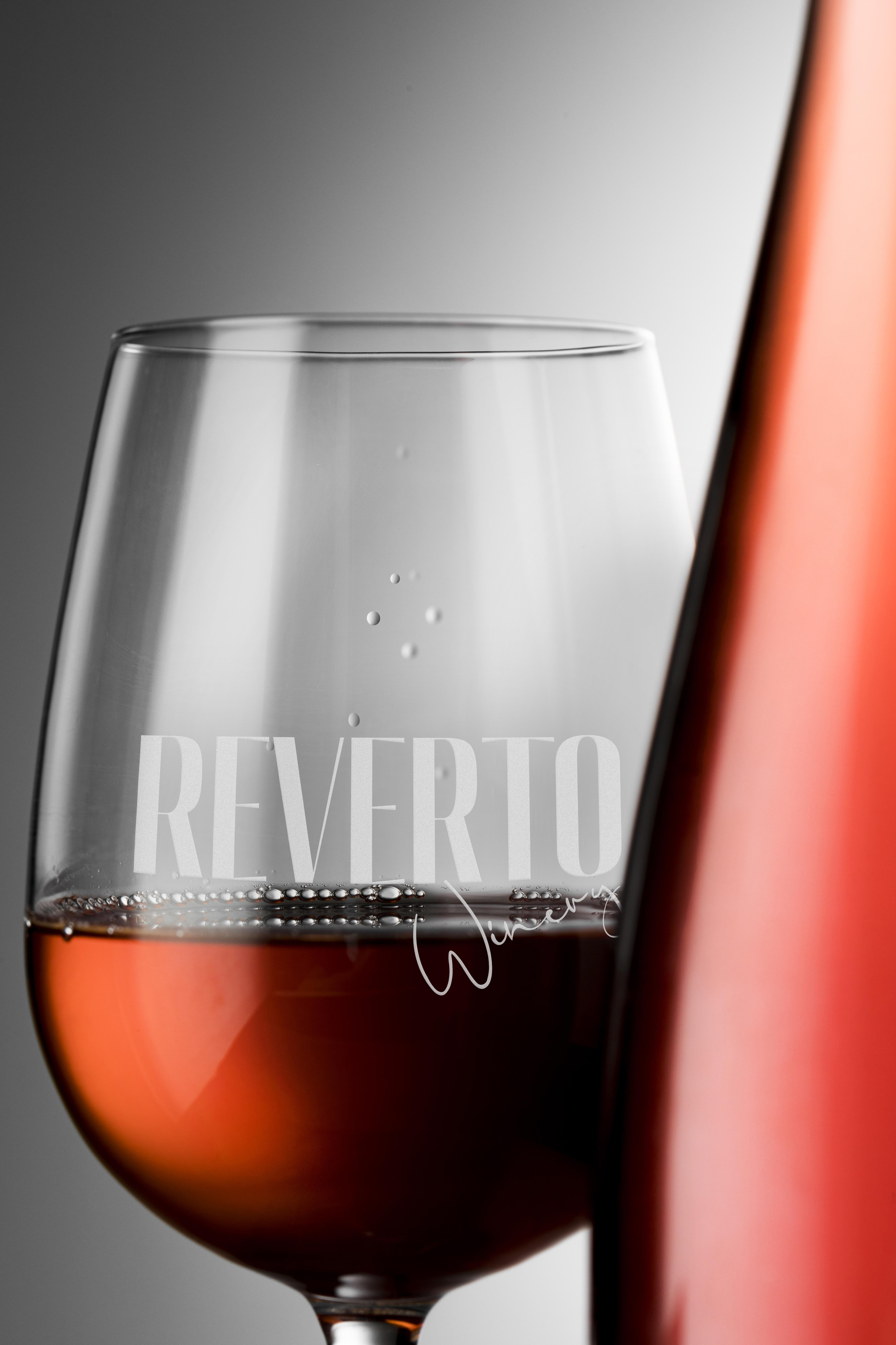
Reverto Winery

The brand needed to balance tradition and modernity while standing out in a highly competitive wine market. The identity had to feel premium, memorable, and flexible enough to support multiple product lines without losing consistency.
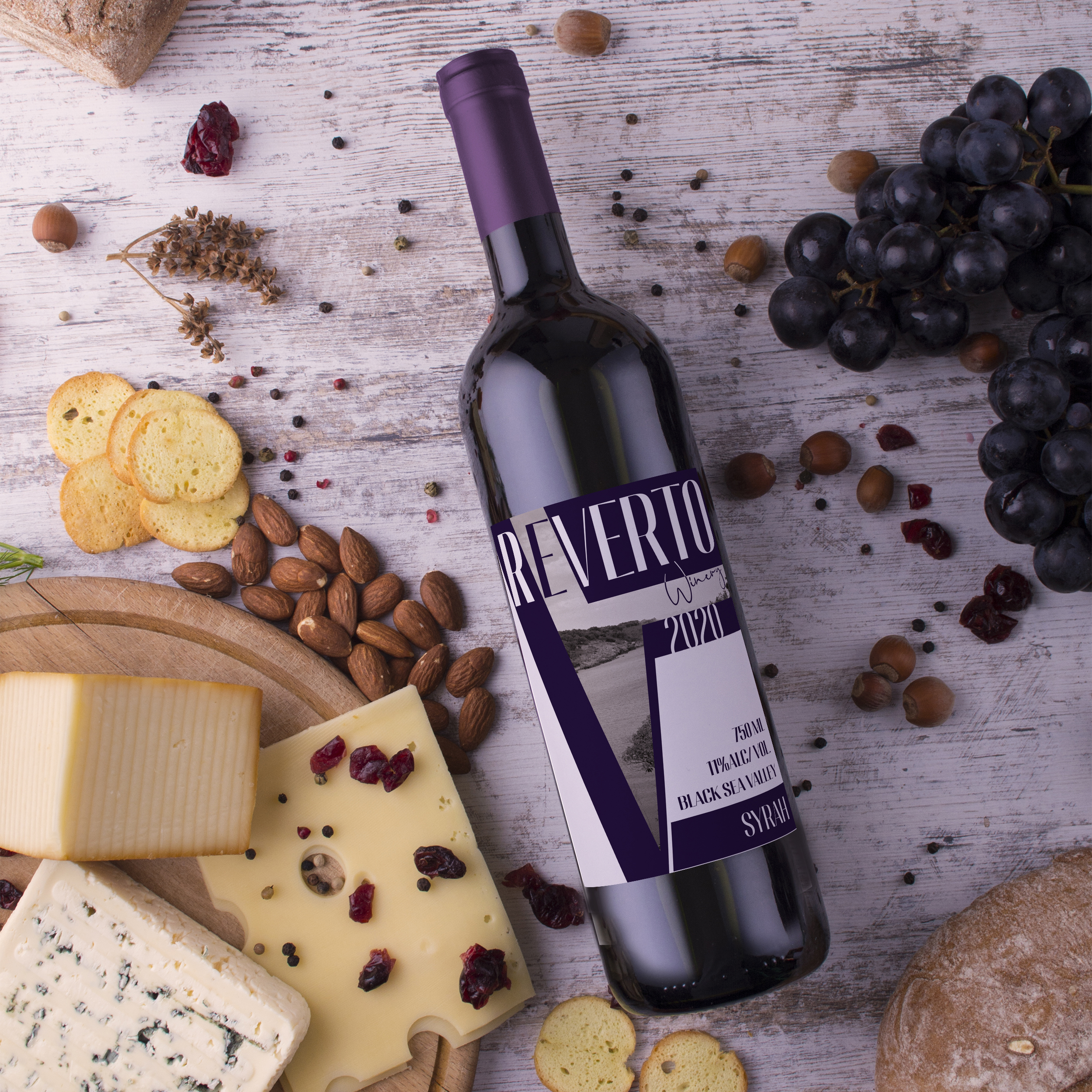
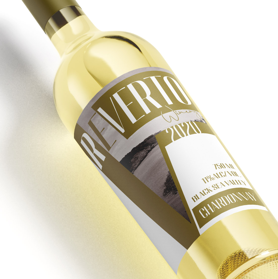
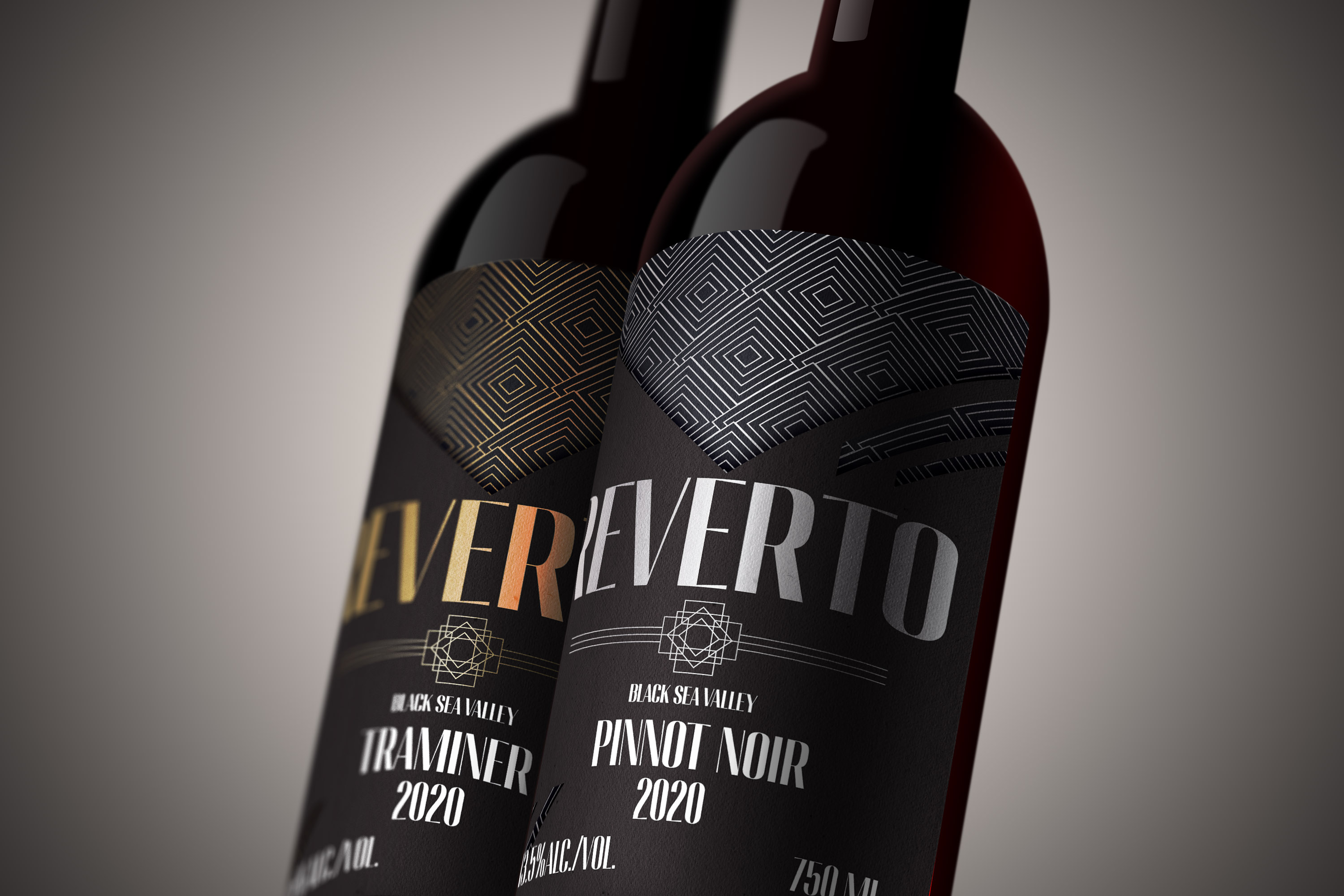
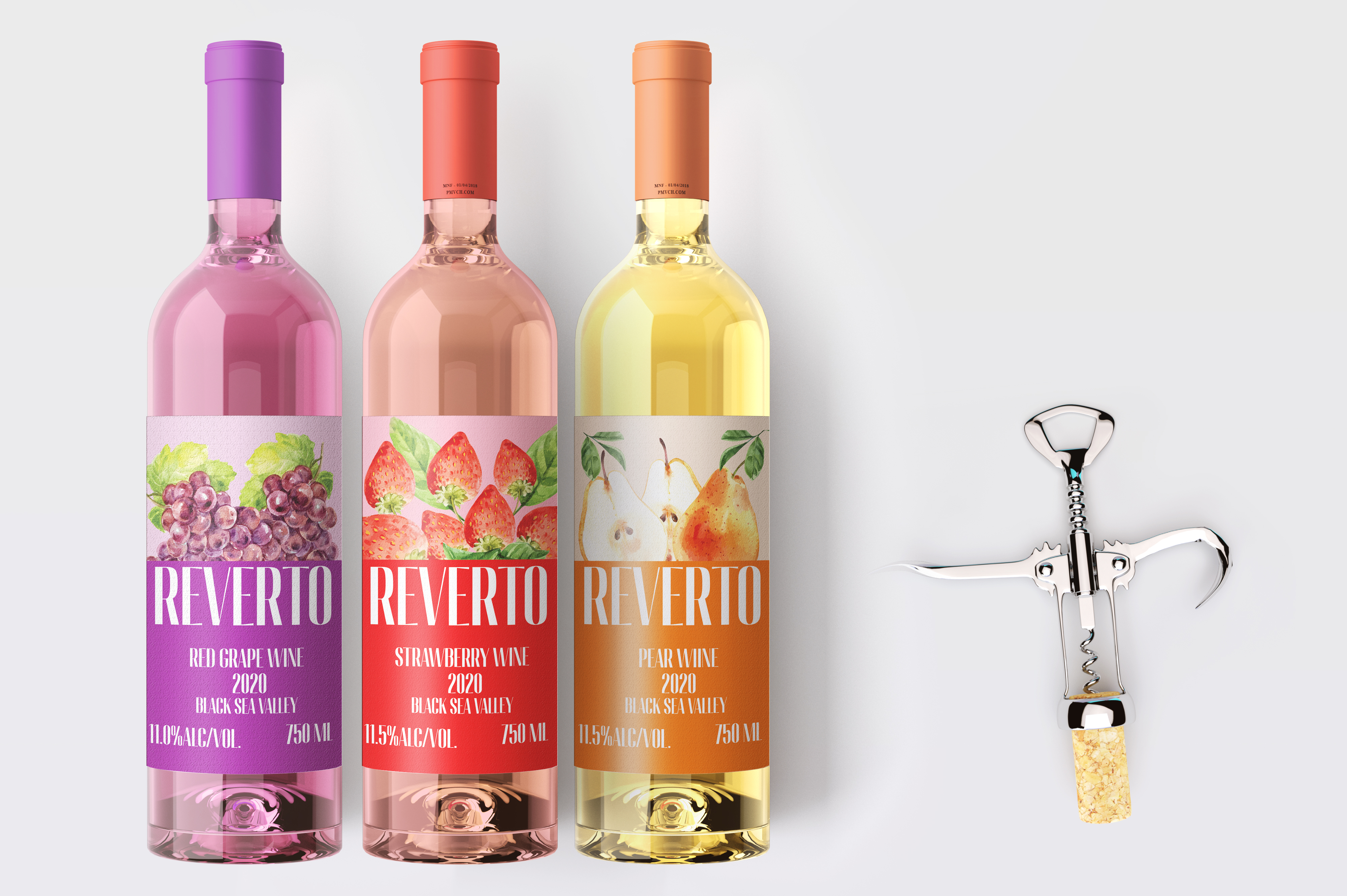
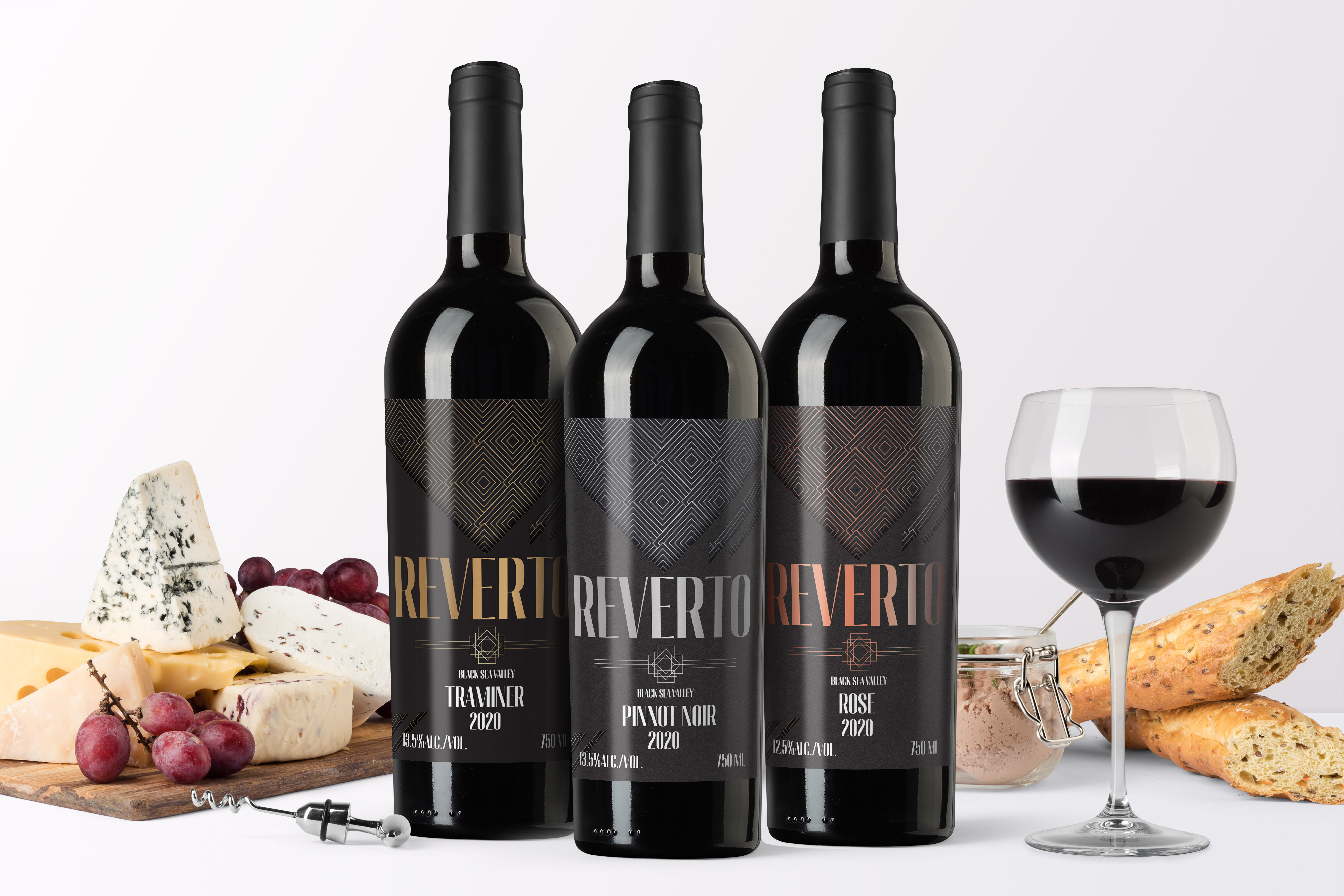
Starting with research into classical wine labels and typography, I developed a bespoke wordmark based on custom refinements to the Migha typeface. Typography became the foundation of the entire identity system, influencing the logo, layouts, and packaging architecture across the entire range. The Classic Selection introduced a clean and minimal visual language centered around a distinctive “V” motif. Within this shape, a local coastal landscape was integrated to celebrate the wine's origin, while subtle color accents differentiated each variety without disrupting the overall collection. For the Premium Selection, I created a more refined and luxurious expression using a deep black palette, Art Deco-inspired geometry, and metallic details. The result was a sophisticated visual language designed to communicate exclusivity and elevate the perceived value of the wines. The Summer Special Selection took a more playful approach, combining bold fruit illustrations with vibrant, flavor-driven colors. While visually distinct from the other collections, it remained connected to the broader identity through consistent typography and structural design elements.
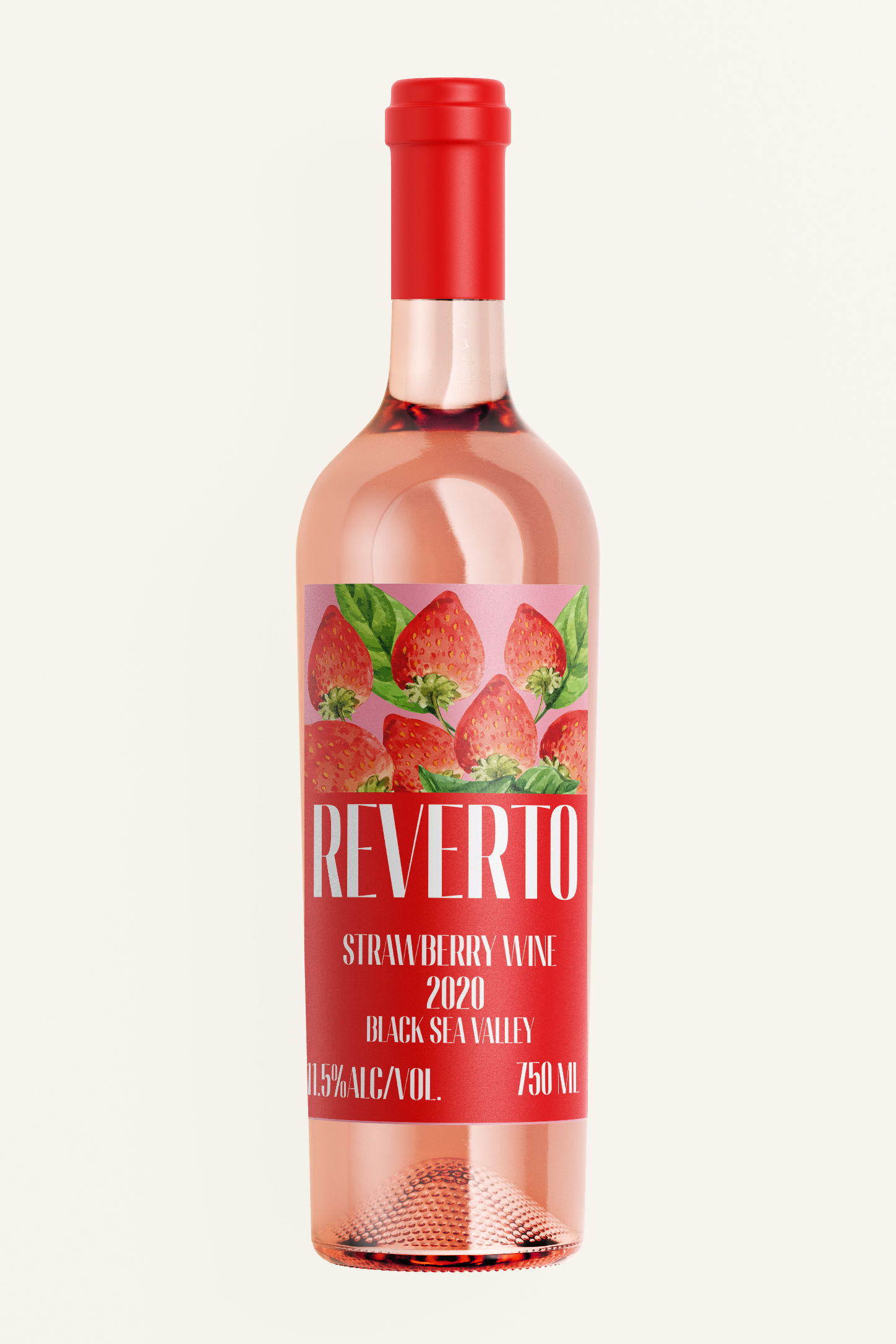
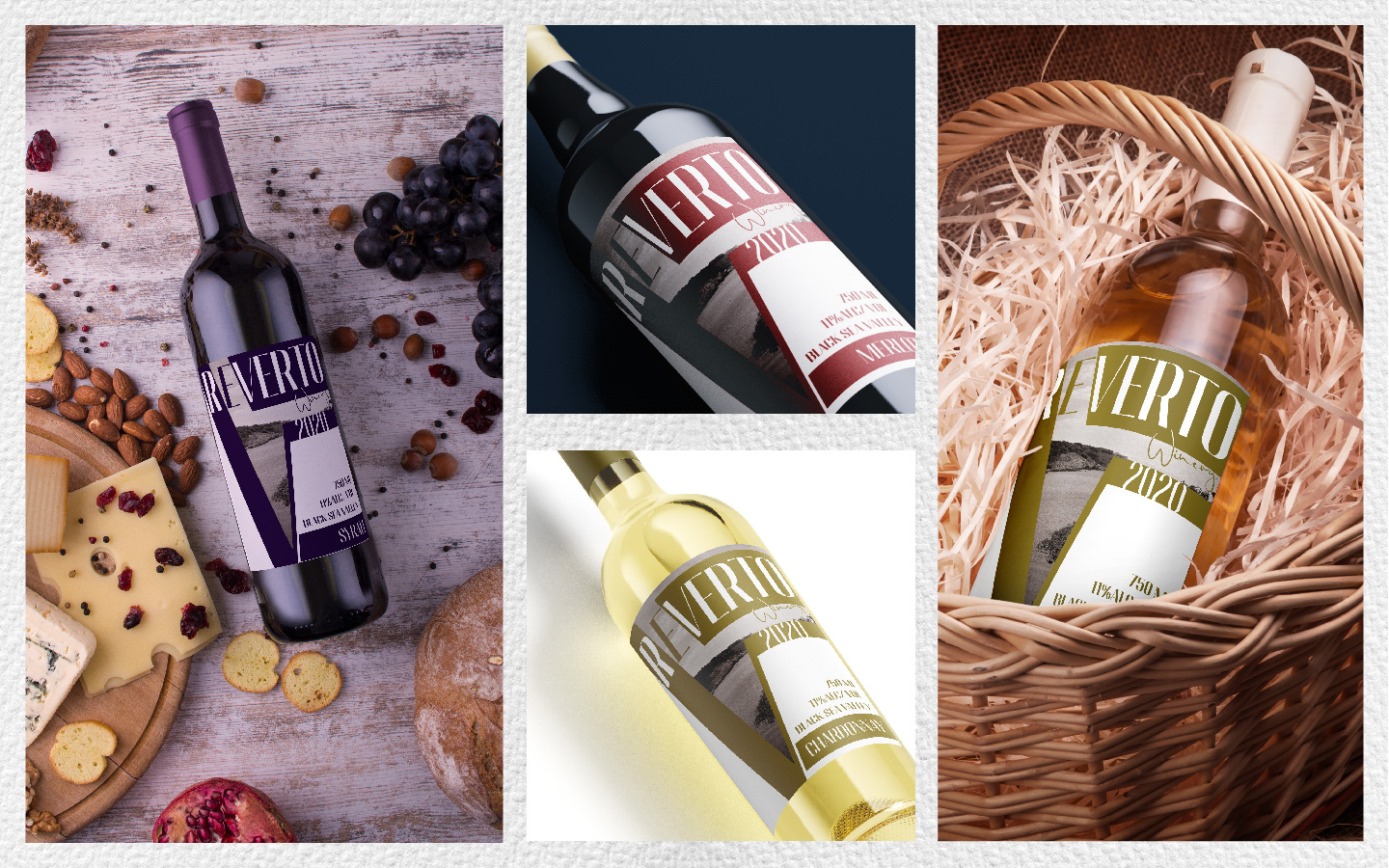
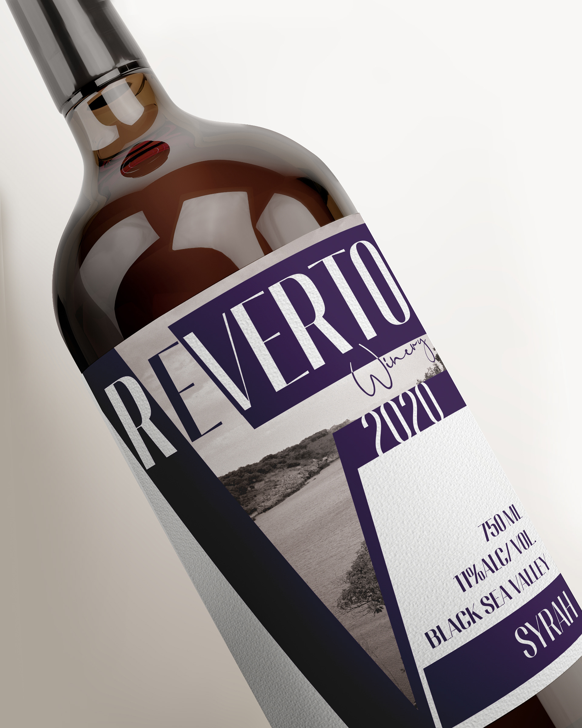
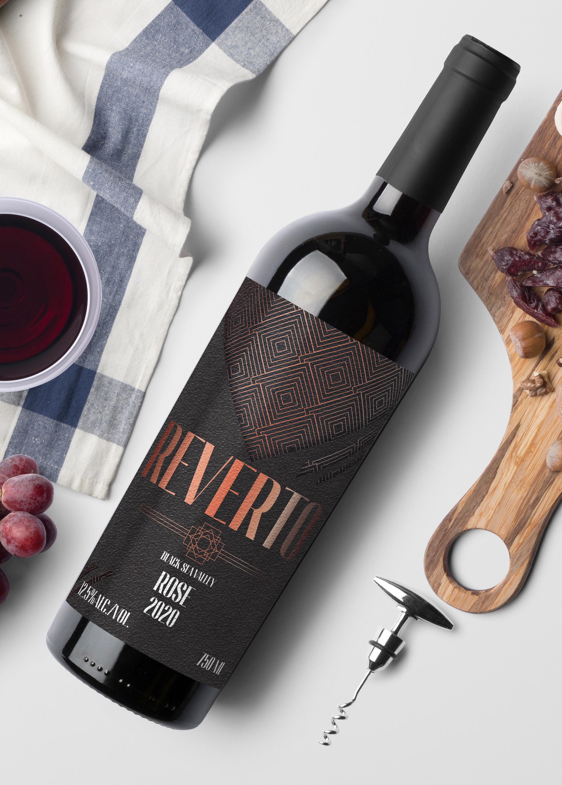
A cohesive brand identity capable of spanning multiple product tiers while maintaining a recognizable and premium presence. The system provides flexibility for future product expansion while ensuring every bottle feels unmistakably part of the Reverto family.
The best label tells you something true about the land.
This project reinforced the power of typography as a brand-building tool. By creating a strong core identity and allowing each collection its own personality, the brand achieves both consistency and distinction across the range.
- Category
- Packaging
- Year
- 2021